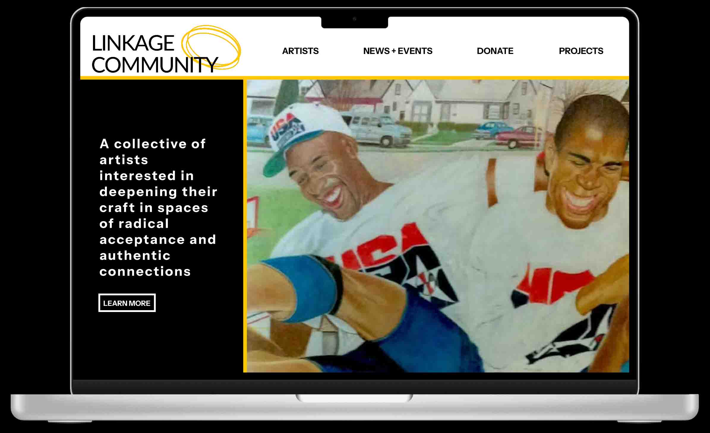
1. Overview
I developed the front-end of the Linkage Community website, transforming its online presence into a more engaging, accessible, and responsive platform that reflects the organization’s mission, supports community connection, and encourages participation.
2. Context / Problem
As part of supporting a community-focused arts and justice initiative (Linkage Community), the website needed to move beyond a basic informational site and become a dynamic hub for engagement—inviting artists, members, partners, and supporters to interact, learn, and connect. The previous site was functional but lacked optimized front-end experience: it needed improved responsiveness, visual appeal, performance, and better support for user engagement features.
My challenge was to build a front-end experience on WordPress that elevated the brand, reinforced the mission of creative community and authentic connection beyond incarceration, and made the site easy and inviting to use.
3. Research & Insights
I reviewed the existing site and benchmarked precedent sites of community-arts organizations, nonprofits, and creative collectives to identify best practices in engagement-driven design (calls to action, newsletter prompts, member sign-up flows, event visuals, story-telling sections).
I gathered feedback from the organization’s stakeholders regarding the priority of “engagement” — e.g., how to highlight “Get Involved”, “Programs”, “Artists”, “News” sections prominently to encourage action.
- A strong hero or initial visual area is essential to capture attention and state the mission quickly (e.g., “a creative network with and for people directly impacted by incarceration”).
- Clear navigation and straightforward page structure help visitors find ways to participate or engage (e.g., “Become a Member”, “Donate”, “Newsletter”), found in the site’s header and menu.
- Visual storytelling (large imagery, mission statements, programs breakdown) helps build connection and trust — important for community-based organizations.
- Performance and responsiveness matter, especially for mobile users accessing the site during events or outreach.
4. Ideation
I sketched layout options in the WordPress theme context: hero area vs full-screen image, placement of primary calls-to-action (“Get Involved”, “Donate”), navigation menu (sticky vs scroll, mobile hamburger vs expanded).
I mapped the user journey of typical visitors (e.g., “artist seeking membership”, “partner organization”, “community supporter”) and aligned page hierarchy accordingly: Home → Mission → Programs → Get Involved / Contact.
Decision: use a clean, modern aesthetic consistent with the user-centric, community-focused mission: minimal distractions, generous whitespace, strong typography, and prominent program/engagement sections.
Engagement-focused features included:
- Hero section with a compelling mission statement.
- “Programs” grid showing offerings at a glance.
- Clear “Get Involved” calls (Become Member / Donate / Partner).
- Newsletter signup and social links integrated in header/footer.
- Responsive layout across devices maintaining usability and performance.
5. Design & Implementation
In WordPress, I customized a theme (or built a child theme) to align with the design vision, integrating HTML/CSS/JavaScript for interactive elements (responsive nav, image galleries, program grids).
Design Rationale
- Typography hierarchy and color palette reflecting the organization’s mission (legible sans-serif font, accessible color-contrast, accent color for CTAs).
- Semantic HTML markup for accessibility and SEO.
- Responsive site implementation with media queries for mobile/tablet/desktop; tested across screen sizes.
- CSS layout using grid/flexbox for program cards and content sections.
- JavaScript enhancements for interactive behaviors (mobile menu toggle, lazy-loading images, smooth scroll).
- Performance optimization: compressed images, conditional loading of scripts, minimized CSS/JS.
- Accessibility: high contrast text, alt text for images, keyboard-accessible navigation, semantic landmarks.
6. Testing & Iteration
I conducted internal testing across browsers and devices (desktop, tablet, mobile) to ensure layout, navigation, and engagement elements worked as expected.
I asked users (colleagues, peers, stakeholders) to try key flows: “Find how to become a member”, “Locate the programs page”, “Sign up for newsletter”, “Donate” link — checking clarity and usability.
- Fixed mobile navigation issues (tap targets, visual feedback for active items).
- Optimized page load and image handling (lazy-loading and image compression).
- Enhanced visibility of engagement CTAs by adjusting placement, styling, and accent color.
After iterations, the site offered improved user flows for engagement, better performance, and enhanced clarity.
7. Outcome / Impact
The front-end development resulted in a polished, responsive website for Linkage Community that clearly communicates the organization’s mission and invites visitor action (membership, partnership, donation, newsletter).
The new front-end supports stronger engagement: easier access to programs, streamlined navigation for involvement, improved mobile experience.
From a personal standpoint, the project strengthened my ability to implement a full front-end build on WordPress—translating design and UX considerations into code, optimizing for accessibility and performance, and supporting a mission-driven organization.
The website now serves as a stronger digital asset for outreach and community connection, and demonstrates my dual skillset in UX orientation and front-end development.
8. Reflection
What I learned: Translating community-oriented mission into front-end design requires careful attention to clarity of pathways for engagement. A clean aesthetic is valuable, but so is strategic placement of calls to action and user flows for involvement.
If I were to revisit the project, I would add deeper tracking/analytics of engagement (CTA clicks, newsletter conversions), incorporate micro-interactions or animations (while maintaining accessibility), and further optimize performance (code splitting, caching).
I’m proud of delivering a front-end experience that reflects my skills in UX-informed development, accessibility, and responsive design—and that supports a meaningful organization with community impact. Going forward, I will continue evolving the site with content updates, UI/UX refinements, and performance improvements.